
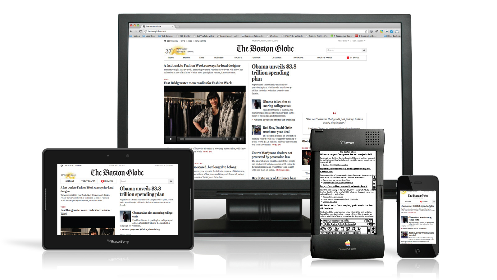
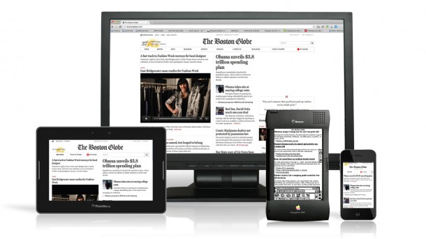
Whether you’re at a grocery store or a rock concert, it’s easy to see that the Web is now being accessed all the time and everywhere. Once relegated solely to the desktop computer, the Internet is now traversed via phones, tablets, laptops and more. As people increasingly make use of ever-expanding technologies to get online, business owners are discovering that their website has to be able to perform well across very different mediums, platforms and screen sizes — or their bottom line will suffer.
If your website doesn’t look good and work well on a smart phone, a tablet and a desktop, then you’re already losing customers. As more and more Internet users access the Web via mobile devices, you stand to lose even more in the future. Responsive Web design is an approach to design that seeks to create sites that will provide a good user experience across multiple platforms and devices. If you’re concerned about your business’s ability to keep up with your customers’ proclivity for accessing the Web via multiple devices, it’s time to take charge with a more responsive Web design.
What is Responsive Design?
Driving traffic to your website is only going to be useful if visitors find your website easy to use, read and navigate, but a website optimized for use on a PC won’t work well on a smartphone unless the design has taken both into consideration. Responsive Web design is a concept borrowed from architecture and initially pulled into the world of Web design by Ethan Marcotte.
Because it starts with user experience and environment first, responsive Web design aims for flexible layouts and images so that when a user switches from her blackberry to her laptop, the website automatically adjusts for the new device’s resolution needs, screen size and scripting preferences. Responsive Web design is an attempt to solve the problem of needing a website for every device that may access it, and while it’s a bit tricky to code, there are plenty of helpful tools out there that will lower the difficulty quotient considerably.
Adobe Dreamweaver CS6
Adobe Dreamweaver is a classic web-building tool, and the CS6 can build adaptable layouts that work for tablets, phones and computers at the same time. By making use of CSS media queries in your design, you can make sure the appearance of your site is as you want it to be depending on the platform that’s accessing it. Dreamweaver also has an app-building function that will greatly increase mobile users’ interest in your business since most mobile Internet users prefer apps to websites.
Adobe Edge Reflow Preview
While it’s still just in preview, Adobe Edge Reflow makes use of a grid or box system that will scale with your design depending on the device accessing it. You start by choosing to build a desktop or mobile site, but as the design progresses, you’ll be able to toggle between the two designs to ensure that your design is scaling in both formats the way you want it to. The main advantage to Adobe Edge Reflow is that it allows a website designer to test ideas visually on both platforms throughout the design process.
TopStyle 5
An HTML5 and CSS3 editor intended for use with Windows, TopStyle 5 enables responsive design in a number of ways. It has a tool that lets designers make use of the layout gradients that are a helpful part of CSS3 but quite difficult to code. All a designer has to do is specify the gradients for use in layout and then go back and edit them later. Until CSS 3 is finalized, however, any designer using TopStyle 5 needs to use CSS vendor prefixes in order to ensure there aren’t any conflicts between browsers.
WinkSite
WinkSite is a mobile service that won’t help you build a website, but it will help you do a better job of placing ads in your Web design if ad revenue is something your design needs to consider. Determining where to place ads on your Web site’s pages so that the design — and the ads — still work across multiple platforms can be tricky business, but WinkSite can help. Free for up to five mobile sites, WinkSite is also a mobile, online community.
As more and more people hit the Web on more and more devices, having a website that can traverse all those spaces is getting more and more difficult. The concept of responsive Web design, while still in its infancy and far from perfect, is the best bet most businesses have for reaching their customers while they’re on their phones, tablets and computers.
Photograph by Antoine Lefeuvre